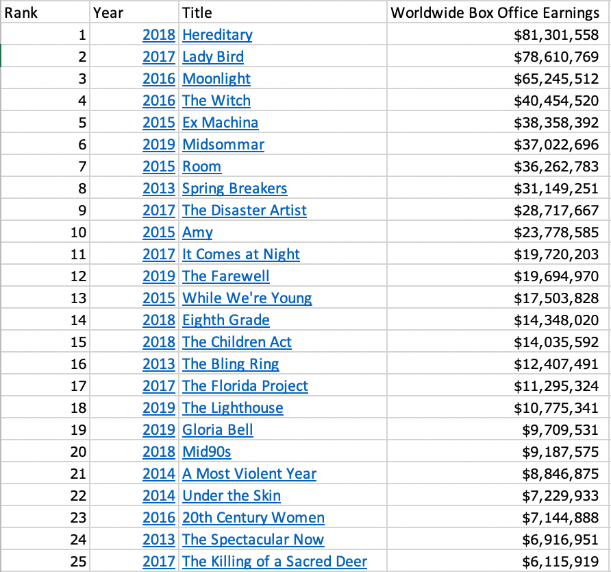
Introduction

The data that I chose to analyze for this project explores the highest-grossing films that have been produced by A24. This independent, American entertainment company was founded on August 10, 2012, by Daniel Katz, David Fenkel, and John Hodges. A24 is based in New York City and is responsible for producing movies such as Hereditary, Lady Bird, and Moonlight, amongst other well-known works. They have also produced popular television shows such as Euphoria, which premiered on HBO.
Originally, I had begun researching data on the highest-grossing films of all time, regardless of what studio they were produced by. As I am currently completing a minor in film studies, I believed that this topic would be one that I find the most engaging, and one that I could easily relate back to myself and my educational background. I am also in the midst of writing my film studies capstone paper and wondered if the data found in this project could assist me with this research as well. However, upon analyzing this original data set, I realized that I was not truly interested in any of the films on the list. While there is, of course, some merit to the fact that these movies are currently holding the record for all-time highest earnings, I never found myself enjoying any of them. Plus, creating a design with the word “Minions” on it did not feel very professional. I also found the data to be difficult to work with, as the release date of Titanic made creating the visual a bit less easy to do. I understood that I still wanted to explore data in relation to film, but I needed to find a data set that I really cared about. I thought about all of the films that I have been enjoying in the past few years and tried to find a commonality between them. Many ideas crossed my mind, including the exploration of horror, cult, and independent films. But rather than focusing on a specific genre, I decided to narrow it down to the studios that produced them. This led me to my research on the films of A24. Having already seen 16 of the top 25 all-time highest-grossing A24 films, I knew that this would be a suitable topic for my project. The 17th highest-grossing movie on this list also happens to be one of my personal favorites. I was able to find my data on various websites, which allowed me to easily export it into various software like Microsoft Excel, and RAWGraphs. After doing so, working with and analyzing this set became much less difficult.
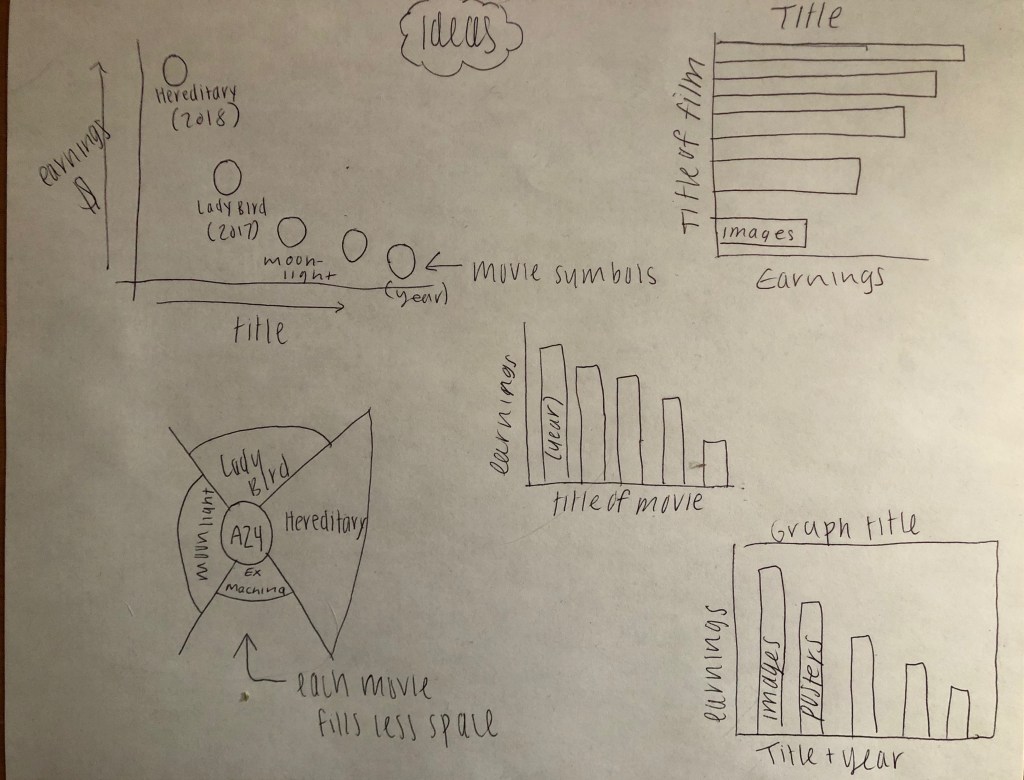
The original plan for this graph was to utilize a scatter plot, with each plot point utilizing an image taken directly from the film. As a promotional tactic, A24 will often release enamel pins with a prominent symbol from the respective movie. These were the images that I had initially intended to use. Upon creating this type of graph, however, I felt that the difference in rank between the film earnings could be more immediately obvious. I wanted to convey each data point in the clearest manner possible, and so after trying out various different types on RAWGraphs, I decided on creating a bar graph.
The bar graph that is included in my visual is organized by descending rank from the all-time highest-grossing A24 film to the 25th highest-grossing A24 film. Rather than utilizing basic colors to separate each individual bar, I decided to fill the bars with images that were related to each film. Each bar shows the name of the film that it represents, in the manner that they were shown on their perspective promotional posters. By doing so, the viewer has accessible, visual clues that may assist them in understanding what exactly the movie is that is being discussed. For example, I am not great at remembering the names of the films that I have seen. However, when I see an image from the movie or the movie poster itself, it makes it much easier for me to remember the film. Thus, I wanted to incorporate this aid and help the viewer by providing this extra bit of context. Although I am really happy with the end result, I did run into a bit of a problem with the movies that were ranked lower on the list, and thus had a smaller bar on the graph. For Under The Skin, and The Killing of a Sacred Deer, I included only part of the title from the poster so as not for the image to be blurry or unreadable. Since only part of these titles is shown in their perspective bars, I included a label on the x-axis that states the title of each film without any special formatting. This was also done for accessibility, as not all of the movie posters utilize an appropriate color contrast in their titles. For those with difficulty seeing color, this choice of design can help them to properly view and analyze the graph.
The background is a collage from various films that A24 has released, anchored together by the studio’s logo in the middle. I chose to use this image because it did not focus on one particular film in the way that the graph did, but rather encompassed a number of A24 projects, and provided a more immediate context when first viewing the graph. If one does not wish to analyze the numbers in the graph, they will at the very least understand what the information is about.
As this data regards A24’s highest-grossing films as of 2019, it leaves the question of: how could the information on this graph change throughout the years ahead? On average, A24 distributes and produces around 18-20 films each year. With this knowledge, one can assume that many of the movies on this specific list will be subject to change. While this may be true for some of them, it is also important to understand a recurring trend within the film industry. Much like the music industry, some projects that do not garner immediately positive reviews will experience a rise in popularity at a later date. There are a number of reasons as to why this could happen, such as cultural relevance, current trends that borrow from the past, and many others. While this graph only explores the box-office earnings, many older films will often be re-released in theaters for a short period of time, usually on a notable anniversary date of the film’s release or due to the aforementioned rise in popularity, and this could also allow for the number of earnings to increase. Regardless of how the information within this graph changes in the future, it is certain that there will be some type of transformation. Should this project be continued in the future, it would be compelling to see what new releases might earn their place in the top 25, and which films stay on the list for all-time highest-grossing A24 films.
Like many of my projects, I found this process to be both challenging and helpful. Although I am still not as confident as I would like to be in using Adobe software, I can tell a difference in my abilities from the first project that we completed, until now. I’m proud of the final outcome and look forward to creating more graphs like this in the future, but now with the new knowledge that I possess.
Data
Visualization
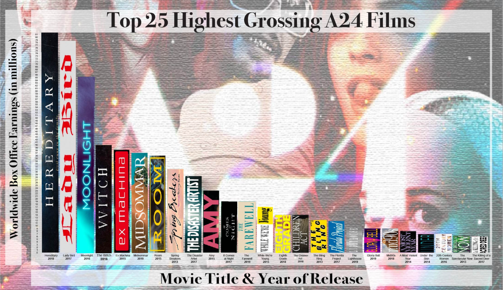
At the top of my data visualization is a title that describes the information within the graph, which reads “Top 25 Highest Grossing A24 Films”. For this title, I utilized a black font, similar to the one used in the A24 logo, positioned against a slightly transparent white banner. By placing the text in front of a banner, the title thus stands out against the background. The box that the title is in connects to a frame of the same color that surrounds the data of the graph. This frame not only includes the title, but also the number scale on the left side of the image (x-axis), and the movie titles/release dates beneath each bar (y-axis). The background of the graph is a collage that showcases prominent characters from popular A24 films such as Spring Breakers, Ex Machina, and Room. Hues of green, blue, and purple overpower the background. This image is anchored by the A24 logo that overlays the collage. Colors Since there are many colorful details within the image that was used for the background, a decision was made to turn down the opacity. Below the title is a bar graph that shows the top 25 highest-grossing A24 films of all time in descending order (from the highest to lowest on the list). Due to this, the highest bar is on the left side of the image and the lowest bar is on the right side. In between, each bar gradually decreases and forms the shape of a downward slope. In order to provide visual context for each film without crowding the space, each bar on the graph is filled with images from their respective films. Images that were used for this have been taken from the promotional poster that was released with the movie, so as to appropriately capture the aesthetic of each film. The opacity of the individual bars was not altered so that there would still be a clear contrast against the background. On the y-axis is the scale of possible earnings, shown through the use of simplified numbers so that each amount on the scale is easier to read. In order to avoid confusion in simplifying these numbers, the y-axis is labeled “Worldwide Box Office Earnings (in millions)”, also using a faded white banner and black font. On the x-axis, underneath each of the 25 bars, is a label with both the name of the movie as well as the release date. For example, beneath the first bar is the label “Hereditary 2018”. This label is also part of the graph frame. In a faded banner that is separate from the graph frame, the label for the x-axis reads “Movie Title & Year of Release”. The label is in a black font that is similar to the A24 logo.
Design Page
The various aspects that went into this design were elements that required a lot of thought in order for the visual to be appealing, informational, accessible, and cohesive. I’ve briefly discussed some of these elements such as the use of color, altered opacity, and font choice, however, it is important to reiterate why I made these specific choices. The typography that is used for larger sized texts is the Bodoni Bold font, while smaller bodies of text are shown using Arial. Bodoni was the font that I found to be closest to the one that is used in the A24 logo, and also one that I was able to use for free. Although I believed that this particular typeface made the graph look the most cohesive, I wanted to avoid using it for smaller texts, as it is more difficult to read in a small size. To remain accessible to those who may have difficulty reading small, decorative fonts, I decided to use a friendlier font like Arial for the title labels and the number of earnings.
Accessibility and readability also influenced the decisions made for the background image. Originally, the collage in the background of the graph showcased bright, striking colors. When juxtaposed against the images that were used for each bar in the graph, the visual became difficult to read and distracting to look at. For this reason, I layered a textured filter on top of the image in order to blur some of the finer details. I then altered the opacity so that the colors were not as stark. This adjustment allowed for my visual to maintain an interesting background while not creating a distraction or taking away from the importance of the data.
As previously mentioned, the data set and bar chart area of the visual are framed in a slightly transparent, white banner that connects the graph title, numbers on the y-axis, and the movie titles and release dates on the x-axis. Other bits of text, even those outside of the frame, are also positioned against faded white backgrounds. The inclusion of all of the white banners is intended to separate important text from the images in the background. The use of connection certain elements with a cohesive, monotone frame can also partly be attributed to this. In addition to this, framing the graph also helps to establish the main focus of the visual. Although the background catches the eye, framing the data guides the eye to the appropriate space within the visual.
Conclusion/Analysis
Looking at the data, it is important to recognize that the earliest dated films on the list are from 2013. Although A24 was established in 2012, the company did not truly begin to grow until their release of Spring Breaker’s, directed by Harmony Korine. Despite the studio’s first release of A Glimpse Inside the Mind of Charles Swan III having included big-name actors such as Charlie Sheen, Bill Murray, and Patricia Arquette, the reviews it garnered were largely negative. A24’s third release of Spring Breakers held even more star power, including actors like Selena Gomez, Vanessa Hudgens, Ashley Benson, and James Franco amongst others. While not all subsequent A24 film releases include such high-ranked actors, I believe that the initial success of the company can be attributed to this aspect. Thus, this data makes a further commentary on the film industry as a whole, and how many viewers have begun to value this star power over quality content. The reviews of Spring Breakers are mixed, yet they lean more so towards negativity. So why is it the 8th highest-grossing A24 film, and why did it jumpstart the studio’s success? It thrived on the power of multiple well-known actors.
I believe that it is also important to understand A24’s marketing strategies in reference to this particular data set, particularly in reference to Hereditary, the number one highest-grossing film on the list. The trailers that were shown prior to the release date of this film failed to give away any of the major plot points within the movie. According to many critics, this tactic was part of what made the movie so intriguing upon release in 2018. Many movie trailers that have been generated throughout the past few years rely heavily upon an extensive explanation of the work that they are promoting. These trailers often leave little to the imagination and depend more-so on other factors to persuade viewers into seeing the film. A similar tactic was used for the promotion of Midsommar, the 6th highest-grossing A24 film of all time, likely due to Ari Aster directing both movies. This aspect also allows the viewer of the graph to make a connection between these two top-grossing A24 films, and movies that have been produced by other studios. While other studios may produce films that earn more at the box-office than these particular A24 movies, the information within this graph sheds light upon the possibility of higher earnings through the use of a more cryptic promotion.
Overall, I found the information within this graph to be very interesting and slightly surprising. Films that I did not believe would be on the top 25 list were ranked fairly high, and some of these higher-ranked films surprised me. Although these assumptions were based partially on the movies that I had heard the most about, films like Amy and The Florida Project had a very limited release. While both of these works are ones that I found highly enjoyable, I believed that the smaller release would have hindered their success a bit more. Other films and the accompanying rankings were exactly as I had expected. As the type of film analysis that I usually complete for my minor is more of a visual exploration, I found this project to be very useful in helping me to research new aspects of the industry. While I look forward to continuing my journey in learning to use the Adobe software, I am proud of how my project turned out.
Rachel’s Project
This project has been completed for the ENG/IMS 411 course.
